Reviewing the Dream Ship
It was one of the greatest achievements for naval engineering at the beginning of the 20th century, as the RMS Titanic was already creating expectations even before it was launched, a ship that was more than a transatlantic liner, it was a floating palace.
However, he was not an only child since he had siblings who, although less luxurious than him, could compete with him in size; namely the RMS Olympic and the HMHS Britannic. A triad that showed the world the enormous potential of his shipping line, the White Star Line.
What you would never imagine is that one of them would become a legend in the wake of his disaster. For the Titanic has evolved as more than one of the famous Olympic class ships, the Titanic is an icon per se.
A legend that was broken at an early age and that never had an image in life that was not linked to that of its shipping company, a ship that contained hundreds of objects under the same seal as all the others, the seal of the White Star Line.
Here is one of the main reasons why it was decided to carry out this exercise of pure design, to try to imagine how it could have been one of the most famous ocean liners in history, if its legend had won it in life.
When undertaking a project like this, it was important that everything created be developed from elements that already existed on the ship, since it is not a question of building on something invented but on what already formed the spirit of the ship.
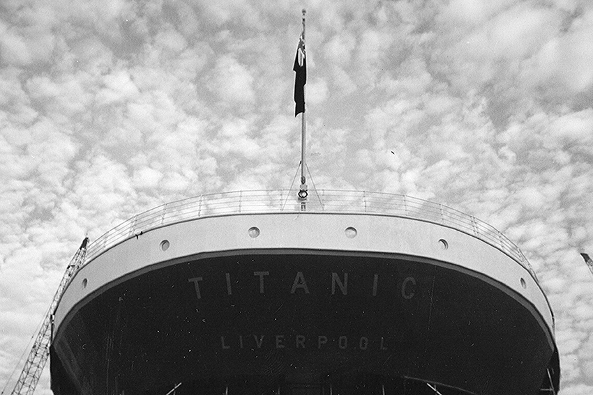
So… where to start? Well, by its own name, a name that has gone down in history but which in 1912 barely occupied the stern of the ship along with a few other places. A new Graphic Identity was designed for it, a stamp like that of the White Star Line but for the first time exclusive to the RMS Titanic.
The new Graphic Identity is inspired by elements that already had its name on the stern, a more public and larger place in which it was reflected. The font and the separation between characters are taken from it, the colour chosen is black as it is one of the most outstanding colours on the outside of the ship and a sign in addition to the logos of the time.
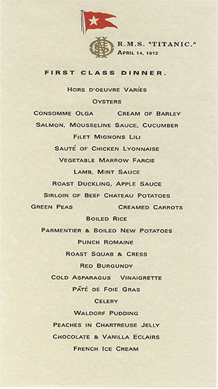
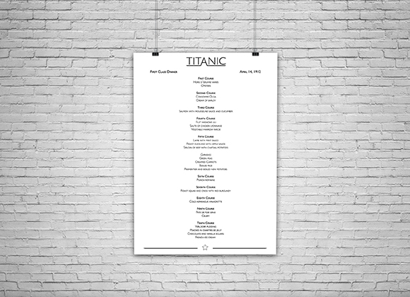
Once an element as essential as your Graphic Identity is established it is time to apply it to objects present on the ship; in this case the chosen one is the menu of the last dinner on board for the first class dining room. The different dishes have been reorganized, the new design has been added and the original illustration that carried the menu on its back has been preserved.
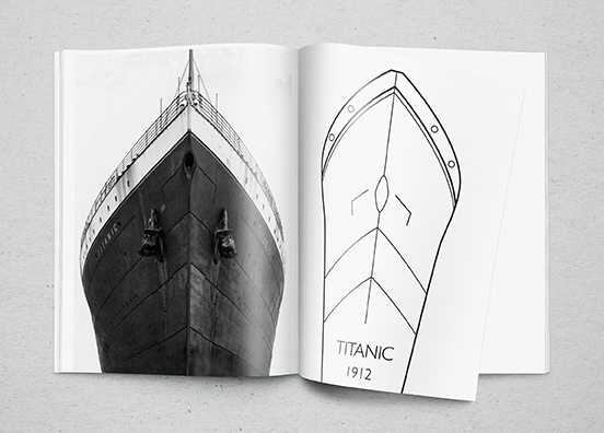
As a development exercise for the design of these objects, a nib is created, which would be set in a body specially designed for it. The clear inspiration can be seen in the bow of the boat, a place that cuts through the water on the sea like a nib does on paper.
However, one of the greatest challenges, if not the greatest, is the design of one of the most emblematic objects within the transatlantic and which was also used daily as the centre of social life during the voyage; the dishes in the first class dining room.
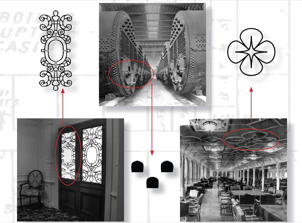
But how to find suitable ornamental motifs for this type of decoration? Well, as mentioned above, each and every one of the motifs for the design comes from the ship itself. Three main ones have been chosen for the creation of the dinner service, all of them coming from structural elements, namely: the mouth of the boilers (a tribute to the first remains discovered in the ship’s wreck in 1985 during Robert Ballard’s expedition), and ornaments on the doors and ceilings of the same dining room so that the new dinner service matches its space of use.
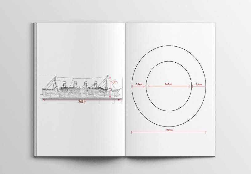
With the ornamental patterns clear, it is time to place them on the tableware without first forgetting to mention its measurements, since the diameter of the plates and their circular crown correspond to the same length and depth of the vessel, in this case 269m (26.9cm) and 53m (5.3cm) respectively.
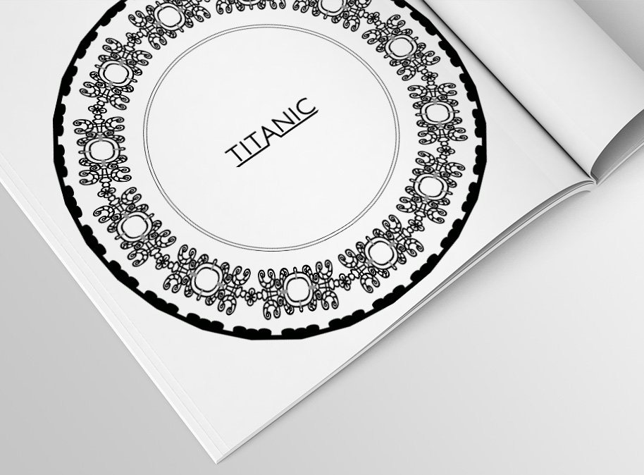
Thus, the resulting tableware includes structural elements and is literally made to measure for the ship itself. The ornaments occupy the space of its circular crown and leave the centre for the previously developed Graphic Identity.
Finally, it should be said that this project is the result of admiration for the RMS Titanic and its legend, and has been conceived with the aim of transporting to the public an image of what the ship of dreams could have been if an image and style of its own had flooded its decks.
Uxía Vila
